******************************** ******************************** /*************************** Typekit code ****************************/ mightaswell: December 2007

Saturday, December 22, 2007

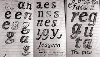
High on typo

The title of this post describe my state of mind these days.
I'm really beginning to like typography, especially the nuances of it.
It might be because of Ali - a very good friend from NID.
I came across this article about typography on font shop. Its a good start. Here's another in the series.


DB typography


Last month i've been to Dusseldorf, Germany for Medica '07.
The first transport we used from Frankfurt airport to Koln was the ICE ,Deutsche Bahn(German Railways). The first thing ( after the good looking train) struck me was the beautiful typography they've used throughout. The signage, the timetable on the platform, the pamphlet, everywhere a coherent typography was used.
I am a great fan of Erik spiekermann, the German type designer of famous typefaces like ICT officina, FF meta, etc. I was wondering who has designed the typo for DB. Today, while stumbling for type designers, i found out the answer. The DB typo is done by none other than the Erik spiekermann along with Christian Schwartz and Tal Leming.
Check out Spiekermann Partners link for the project details.
Here is the link for further details of the font. Unfortunately you can't buy the font. Now that's German exclusivity!
Here's another link to Spiekermann's interview at Pingmag

Thanks Typographica, for the link.